design portfolio of Takumi Yoshida
News (1/1): A very happy new year to you all. | Added my lifestreams page.
Subscribe to taqumi design by Email
- Blog
- Award Winning (6)
- Furniture (4)
- Graphics (3)
- Ideational (2)
- Packaging (1)
- Product (9)
- Wallpaper (2)
- Web Design (2)
eco-boutique
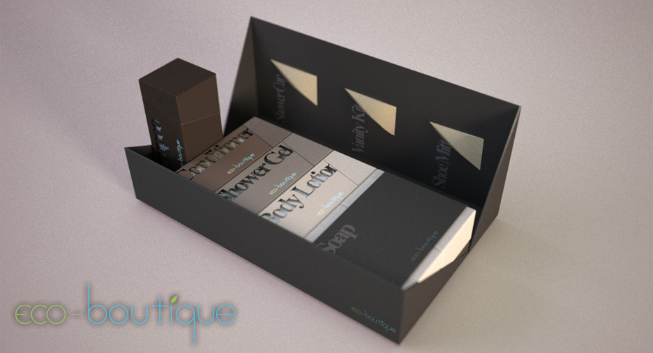
‘eco-boutique’ is a new brand of luxury hotel amenity products which will be produced by [Pacific Direct](http://www.pacificdirect.co.uk).
They provided my university with a brief to design a packaging solution for this brand which promotes sustainability without sacrificing luxury and posh feel to it and approximately forty designs were submitted by students including myself. The packaging needed to include four bottles (shampoo, conditioner, shower gel, body lotion), bar of soap, sewing kit, shoe mit, shampoo hat and vanity kit. This was a part of the university assignment and the whole design was done in seven days.
My submission turned out to be their favourite design and was kindly awarded a prize from the company.
Strategy for sustainability

Cylindrical bottles have the most effecient use of material for a given volume of content, however there will always be wasted volumes around them when packaged. With 27% more material square bottles require 27% less space which converts to approximately 38ml saving in shipping volume for every set of four bottles. This exceeds the volume of another 30ml bottle.
This saving in volume can contribute greatly in making distribution more effecient in large scale
Design features
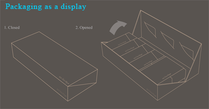
The main packaging case is designed so that it can be used as a welcoming display by simply opening the box thereby reducing the effort required by hotel staff to prepare a room.
In addition, the way the box opens give an extra room between the products and the box lid, making it easier to take the products out.
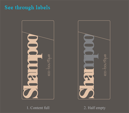
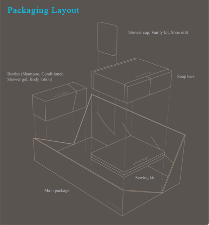
The bottles are opaque with see through labels to easily check the content left not only for the hotel guests but also for hotel staff to check if they need to be replaced.
Large type face also makes it easy to recognise and opaque body colours offer better distinction between different liquids than having transparent bodies with different labels.
Development | Graphics and Colour Scheme
I have began the project by analysing existing hotel amenity designs. Over 500 images were gathered mainly from flickr pools (many people like to take photos of things in the hotel rooms of their trips :-) ) and each of them were tagged with two of the four keywords; cheap, posh, old, modern. While looking at the ones that appeared posh and modern, any potential impression of ‘sustainability’ was explorered in forms and colours.
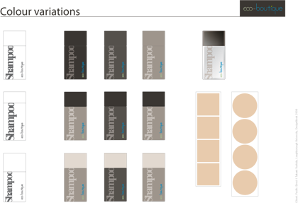
The image on the right shows a part of my exploration of colour schemes around some ‘earthy’ colours and cap/body balance.
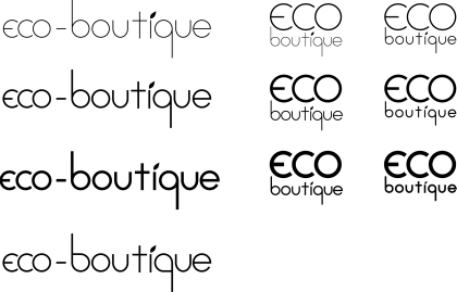
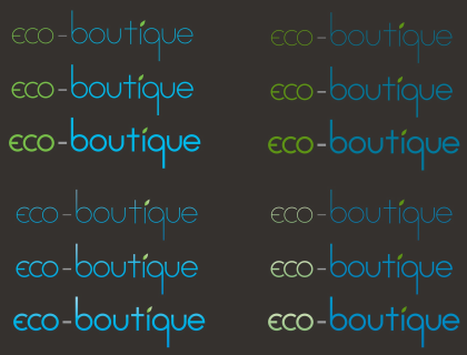
Development | Logo design
Some Initial Sketches
